Branding a Practice Intelligence Platform™

As Senior Brand Designer at Qount, I shaped how an AI-native accounting platform looks, sounds, and feels: a redesigned web experience, campaign systems, event presence, and QAI, the intelligence at the heart of the product.
Purpose
Establish a bold, cohesive identity for the world's first Practice Intelligence Platform™ and make a complex AI system feel simple and approachable.
Methodology
Partnered with leadership to define brand architecture, tone and expression; built a modular visual system, the website, and QAI.
Contribution
Led branding & identity, web/digital, LMS UI/UX, the QAI mascot, and marketing/event assets across every touchpoint.
Impact
A unified brand spanning web, product, campaigns and events, with QAI giving the platform a recognizable, human face.
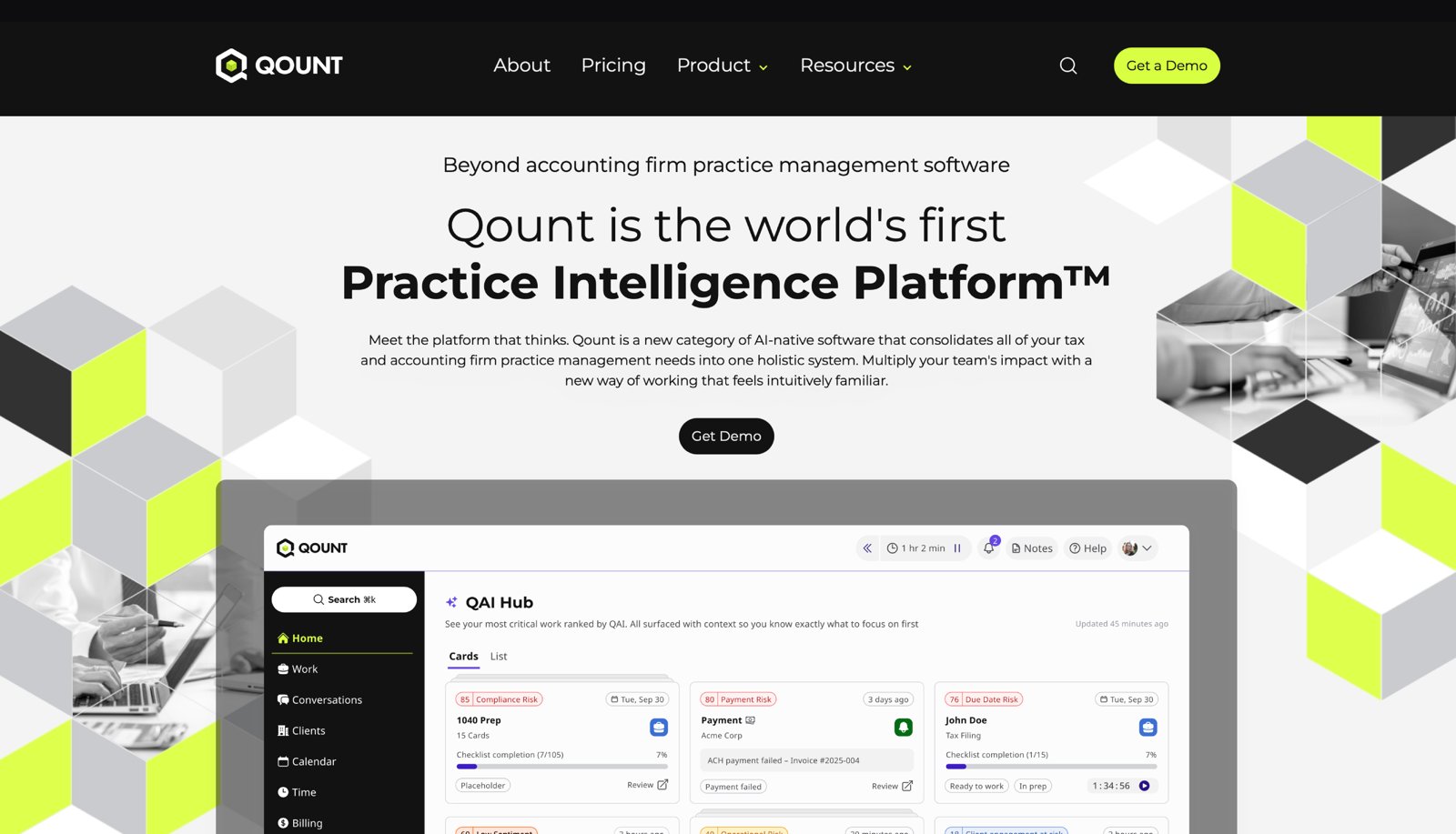
Qount's identity doesn't stop at the website. I extended the dark, modular system into the product UI: consistent color, typography, iconography, and QAI woven throughout, so the brand feels the same from the homepage to the daily dashboard.
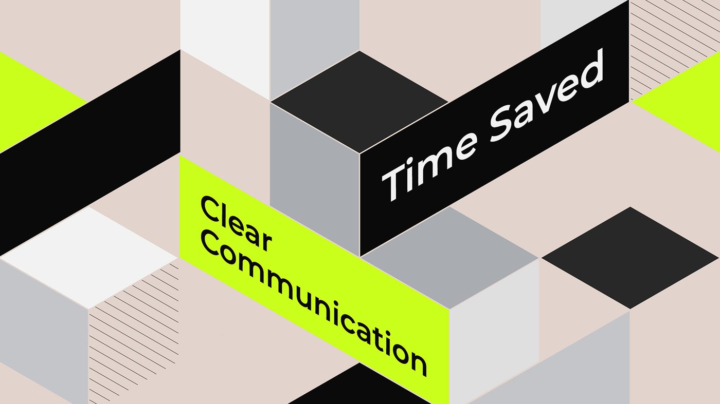
For the "ChatGPT for Accountants" campaign I opened the brand into a full isometric system. Modular 3D blocks, an expanded typographic palette, and a consistent set of motifs. The modularity is the whole point: each isometric block behaves like a piece of the product, modules that stack and connect to build something bigger. It mirrors how Qount actually works, where firms add and assemble the modules they need, so the visual language and the platform tell the same story.


QAI is the intelligence at the heart of Qount, so I moved away from the cold, generic android. It had to feel alive, part of a living ecosystem that evolves with the platform. A bee captured it perfectly: collaboration, precision, and a scalable, modular architecture, like a honeycomb. I rendered it in the same geometric, modular style as the rest of the brand, so it feels warm, approachable, and unmistakably Qount.
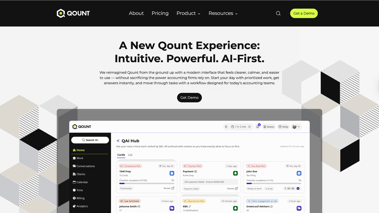

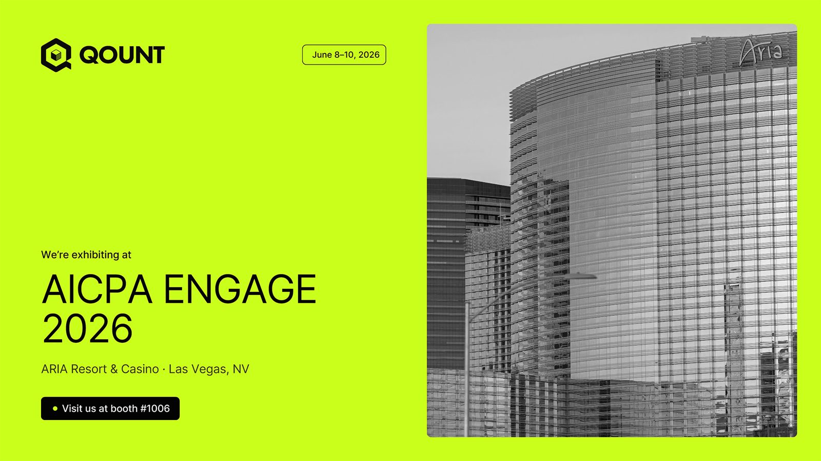
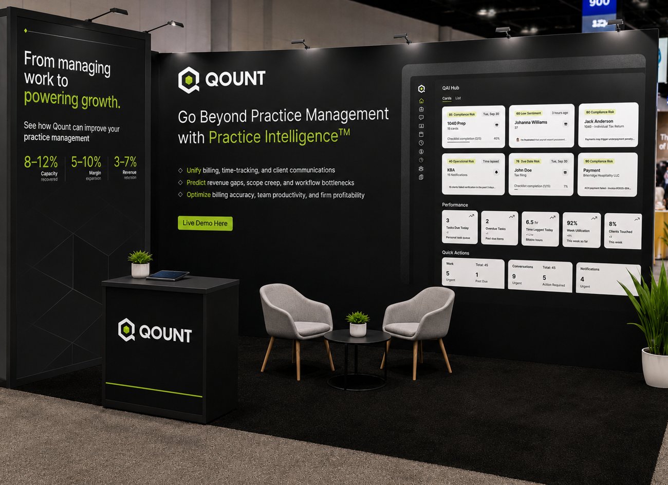
The palette ties the whole project together. Neutrals carry the work, while Electric Lime guides attention as the one intentional accent, in motion and UI highlights. This is the system I defined across brand and product, from the homepage to the daily dashboard.